Find out why we decided to have a rebrand and the meaning behind our new logo...
We are still riding the wave of excitement following the launch of our new logo 4 weeks ago! Our design team - spearheaded by Kelly, Lucy and Tim - have been working tirelessly conceptualising, refining and perfecting our brand new look. We love it so much. To put the cherry on top of the cake, we decided to celebrate with actual cakes adorned with the logo itself! Thank you Lola’s cupcakes!
Why did we decide to have a rebrand?
We were beginning to rethink our website and to reflect on the Appdrawn story. We dissected and explored the imagery of the shield which featured in the old Appdrawn logo and realised we had actually become a bit disconnected with what it represented. It wasn’t our direction anymore. There is still the essence of our work in software development being a battleground of sorts. We want to combat our clients' technology woes, eliminate the problems they face and (a prerequisite) build everything with security and protection at the fore. But after much thought, we think it is the second part of our name that stands us apart. Our USP if you like.
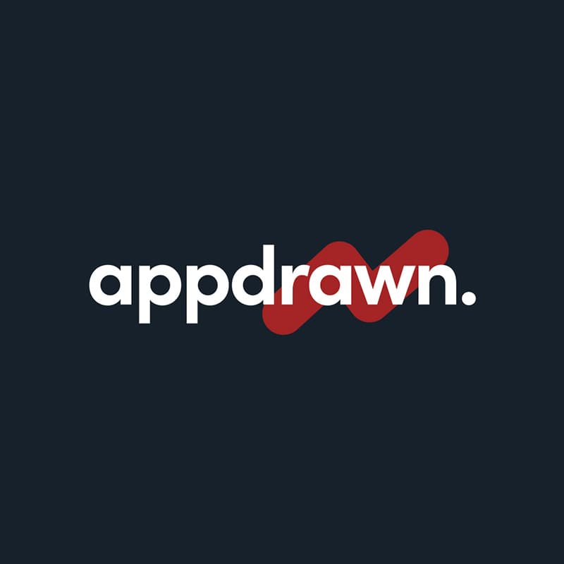
The d(r)awn of the new logo
When you think of the word app, you tend to associate it with technology, complexity, exactness and straight lines… not necessarily drawings. At Appdrawn we have a design led ethos. You can read more about our process here. We do things this way round so that everyone is singing from the same hymn sheet; all parties can 100% comprehend the desired end product before investing more money and committing to the build. We wanted to showcase this part of our name within the logo design. After many iterations we arrived at this creative flourish. For us this really landed and made sense. It feels loose and freehand and embodies the ‘design led’ creativity at the heart of Appdrawn. It also portrays the upwards trajectory of a graph. Growth - this is always our aim. We want to create software that looks beyond the here and now and nature of the problem. Software that looks forward, freeing you up to conquer and explore new ground. Software that unlocks potential and propels businesses to the next level.
Our new font is cleaner and has a contemporary feel to reflect the innovative nature of the line of business we operate in. We have always been defined by our intense red. We want to keep that in our DNA, as it is part of our journey to where we are now. But it has taken more of a back seat in our overall branding. We introduced the navy because not only is it harmonious with red but it also historically represents trust and stability. If there is one word we want our client’s to associate with us it is the former. Trust. We like to cultivate authentic relationships with our clients. We want our communication to be honest and down the line. We earnestly want to create software that works for our clients - we are not interested in selling them any unnecessary whistles and bells.
The full stop symbolises the end to technology problems. End of. Job done.
We want to share our gratitude for the wonderful feedback we have received already for our new look. Moreover, we are excited to see what the dawn of a new logo will bring next!